Email popup examples that actually earn the signup
Two things are true at once about email popups. They work — a well-timed one is still one of the cheapest ways to turn a stranger into a subscriber. And everyone says they hate them. Both are true, and the gap between them is entirely about how the popup is done. A good one feels like a fair trade. A bad one feels like a door slammed in your face the second you walk in.
So instead of a list of rules, here are the patterns that actually earn the signup, grouped by what triggers them — because the trigger is most of what separates the welcome from the annoyance. Steal the pattern, not the wording.
Exit-intent: the last-chance offer
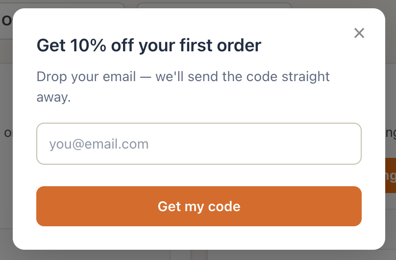
The classic. Someone's cursor drifts toward the close button or the back arrow, and then a small popup appears: "Before you go — 10% off your first order for your email." It works because the timing is honest. You didn't interrupt their shopping; you waited until they were leaving anyway and made one clear offer at the one moment it costs them nothing.
Why it works: it respects the visit. The ask comes at the end, not the start, and it's a real trade — a discount for an email — not a vague "join our newsletter."
When to copy it: any store with a first-order incentive. It's the safest popup you can run.
Scroll-depth: the earned ask
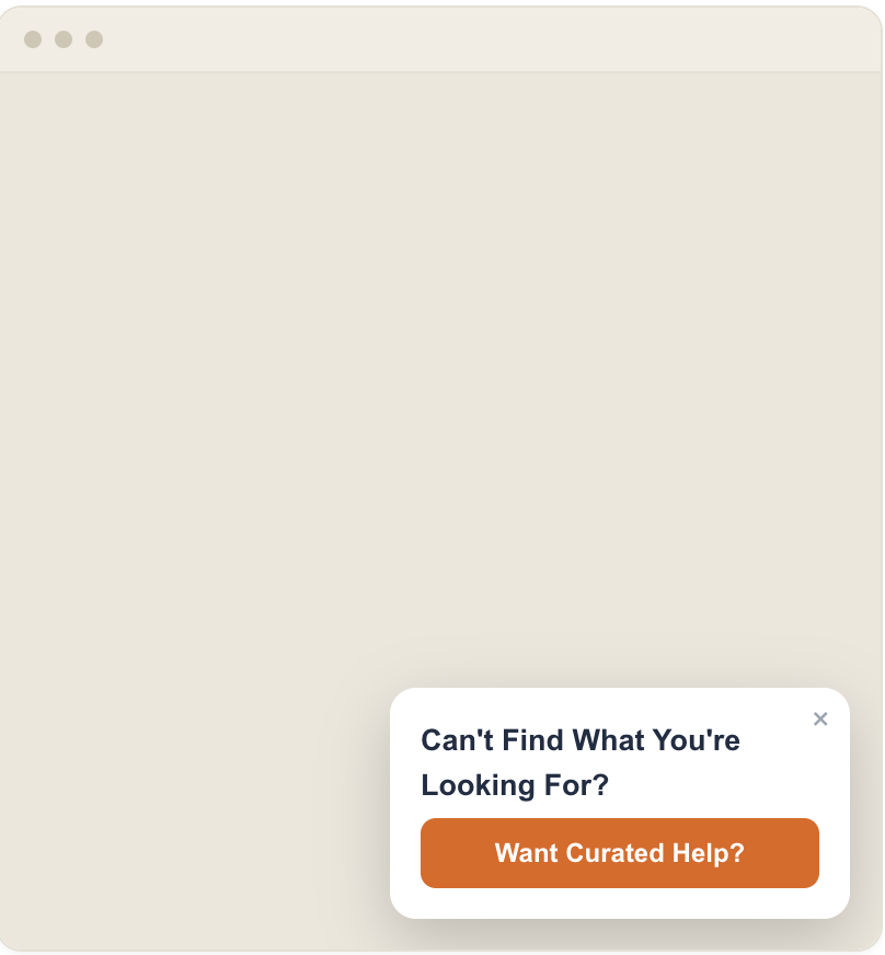
Instead of firing on a timer, this one waits until someone has scrolled halfway down a post or product page — proof they're actually interested — then offers something related: "Enjoying this? Get the next one in your inbox." A content site offering the guide as a download is the same move.
Why it works: engagement came first. You're asking people who've already shown they care, so the yes-rate is higher and the annoyance is lower.
When to copy it: content-heavy pages, long product descriptions, guides.
Time-on-page: the patient popup
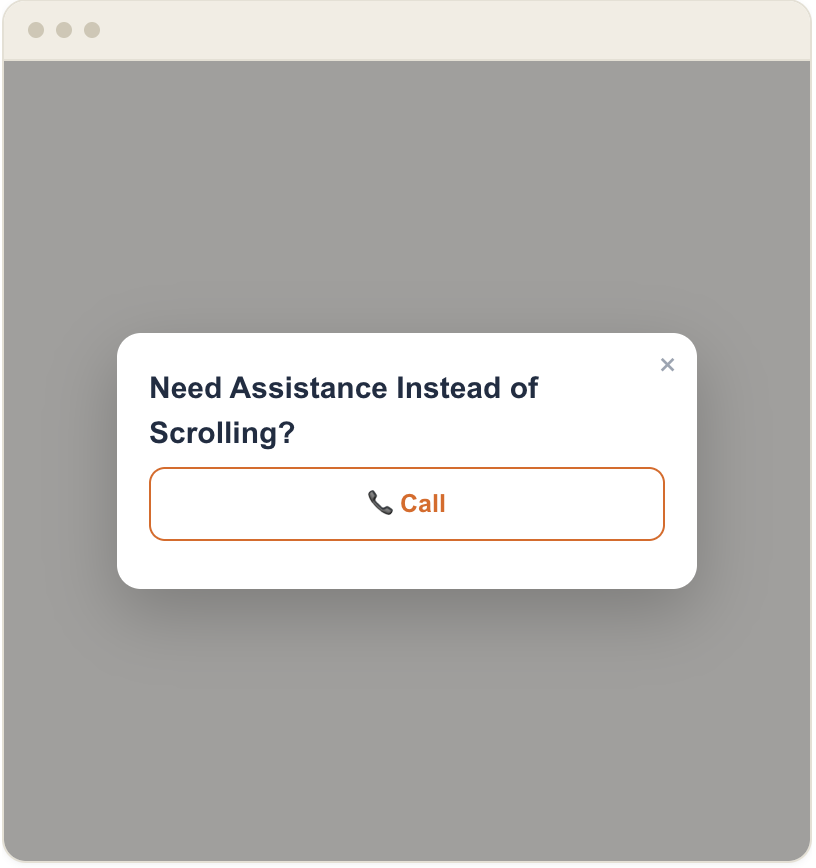
A cousin of scroll-depth: wait until someone's been on the page long enough to be genuinely reading — not three seconds, more like thirty or forty — then make the ask. The mistake almost everyone makes is setting this to fire immediately; the fix is simply patience.
Why it works: time is a proxy for interest, as long as you set the bar high enough. Thirty seconds says "reading." Three seconds says "still deciding whether to leave."
When to copy it: landing pages and articles where people arrive and settle in.
Return visitor: the "welcome back" ask
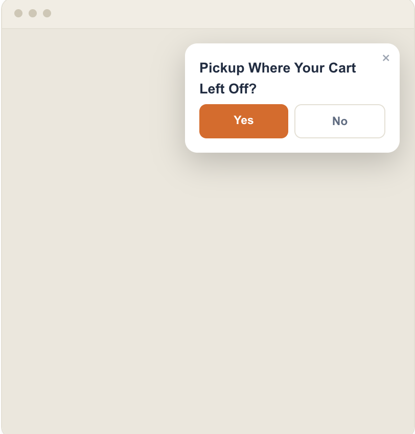
Someone who's here for the second or third time and still hasn't subscribed is a different audience than a first-timer. A popup that acknowledges it — "Back again? Here's that discount to make it official" — converts better than showing everyone the same cold offer.
Why it works: it's targeted. Repeat visitors have already shown intent; meeting them with a warmer, slightly different ask respects that.
When to copy it: any site with meaningful repeat traffic and a way to detect returning visitors.
What the good ones have in common
Look across those and the pattern underneath is the same every time:
- One ask. Email, or a single choice. Not email and a phone number and a birthday on first contact.
- A real reason to say yes. A discount, a guide, early access — something the visitor actually wants, not "sign up for updates."
- Honest timing. The ask comes after some signal of interest — leaving, scrolling, reading, returning — never the instant the page loads.
- An obvious way out. A clear close button and no guilt-trip "No thanks, I hate saving money" copy. The easy dismiss is what keeps the next visit from resenting you.
The mistakes that make people close the tab
- Firing immediately. The single most common error. Give the page a chance to make its case first.
- Firing on every page. Once someone dismisses it, stop asking for the rest of the session. Nothing reads as "we don't listen" faster than the same popup on every click.
- Ignoring mobile. A popup that covers the whole screen with a close button too small to hit is a bounce machine on phones. Test it on an actual phone.
- No easy dismiss. Hidden or tiny close buttons don't trap the signup; they train people to leave.
How to tell if yours is working
Here's the metric that matters, and it's not the one most tools show you first: show-to-submit rate — of the people who saw the popup, how many actually filled it in. Impressions alone tell you nothing; a popup shown 10,000 times and submitted 30 isn't "working," it's wallpaper. Watching the show-to-submit rate is the whole game, because it's the number that tells you whether the trade felt fair.
That's the reason our own exit intent popup software logs shown, submitted, and dismissed for every prompt — so you can see which of these patterns actually earns the signup on your site instead of guessing. And if you're still choosing a tool to build them in, here's an honest look at the Privy alternatives.